Because We Are the Lease-up and Pre-development Experts

Why Peragy?
Since "Call Arounds" have stopped, and getting accurate rental comps takes hours, Peragy has developed a customizable, AI-driven data and reporting solution. It has proven to increase NOI.
And it's not only the data and reports. We provide a Peragy V dashboard of interactive, filter-driven visualizations for all types of professionals, including developers, property and asset managers, and data analysts.
CEO Update: What We Stand For
Innovation, Quality, Timeliness
“Peragy’s software solution has dramatically helped us lease up our Starling property in Nashville with their detailed property summary reports and comprehensive workbook. The availability of the We needed current market information—not outdated history—to truly understand our competitors, and Peragy delivered exactly that. I highly recommend Peragy to other properties in the lease-up process.”
Atlanta-based client
Developer Manager Residential
"As we move into 2026, I know this year will be an amazing one for our clients and our company. I can feel it, as we reach out to new highly interested prospects.
Our clients still use the words, "Love" and "Fantastic" to describe our data, reports, and visualizations." We will keep innovating, ensure our quality remains top-notch, and deliver on-time as we always have done.
If you are looking at us for the first time, I invite you to request a demo. Click here to contact us.
Larry
Larry Brambrut
CEO and Founder
of Peragy, LLC

What you get
with Peragy RTA
(Rental Tracking and Analysis)

Weekly or On-Demand:
-
An Excel workbook which includes the detail data for your rental comps, a regression scatter chart, a leased units analysis, and a pricing analysis.
-
The current Asking Price Property Summary Report
-
The T1 – Trailing Month Leased Units Property Summary Report
Custom Designed Charts:
-
Real-time visualizations of your data with customizable filters quoted by project.
See all the examples below.
Emailed Rental Tracking and Analysis Workbook

The workbook contains.
-
Regression charts for each bedroom type
-
Units that tenants have leased since the previous run for each property
-
Full lists of units for each property, including any price changes
-
A Leasing Analysis sheet
-
A Pricing Change Analysis sheet.
Emailed Property Summary Reports

Based on user preferences, two types of Property Summary Reports are emailed. Users can select the run dates.
Sorted by descending Gross Potential Rent per square foot
-
Current asking price and NER for each property
-
T1 – Trailing Month (leased units) for each property
Emailed Property Summary Worksheets

Based on user preferences, two types of Property Summary Worksheets are emailed. Users can select the run dates.
Sorted by descending Gross Potential Rent per square foot
-
Current asking price and NER for each property
-
T1 – Trailing Month (leased units) for each property
Custom Asking and NER Regression

The Regression Units Visualization is the focal point of rental analysis and price optimization. It shows the price and area of apartment units based on interactive, configurable filters.
The filters let the user see which units are priced closer to the Leased, and Not Leased regressions. Filters include price range, date range, property, area, and bedrooms.
You can toggle between the Leased and Not Leased regressions. You can either use the filter sliders or type in a number to specify a particular value for a filter.
A download button lets you download the visualization's image. It also lets you download the data in Excel, CSV, PDF, and PowerPoint formats.
You can save a specific visualization with its filters as a Custom View. You can recall it later without resetting the filters.
Custom Price over Time (Units)
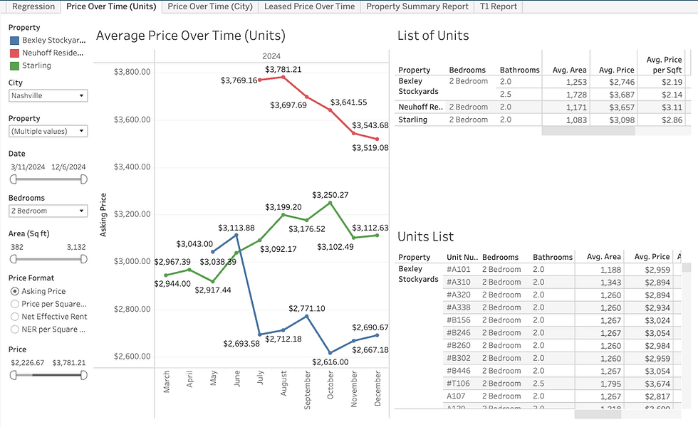
The "Price Over Time - Units" chart shows the average price, or price per square foot, of the selected properties over time. In this way, you can see how your property’s asking prices compare to your rental comps.
Click a point on the chart line. The List of Units (summary) and the Units List (details) will adjust.
Also, you can switch between price and price per square foot. The other filters, like date range, bedroom type, square footage, and property selection, let you adjust the data and visualization.
Custom Leased Units

The Units Leased visualization shows the leased units for 30, 60, or 90 days and selected bedroom types. Hovering over a bedroom type, displays the number of units and average leasing price for that period.
We offer various pricing formats, including: Asking price, Price per square foot, Net Effective Rent, and Net Effective Rent per square foot.